Now that I learned how the units within the National Park Service (NPS) are created and their high-level distinguishing characteristics, it is time to dig into the data. This brought an entirely new set of questions. How many units are there? What is the breakout by region? Does a specific region have more of one type of unit than another? What does the acreage profile look like for the NPS?
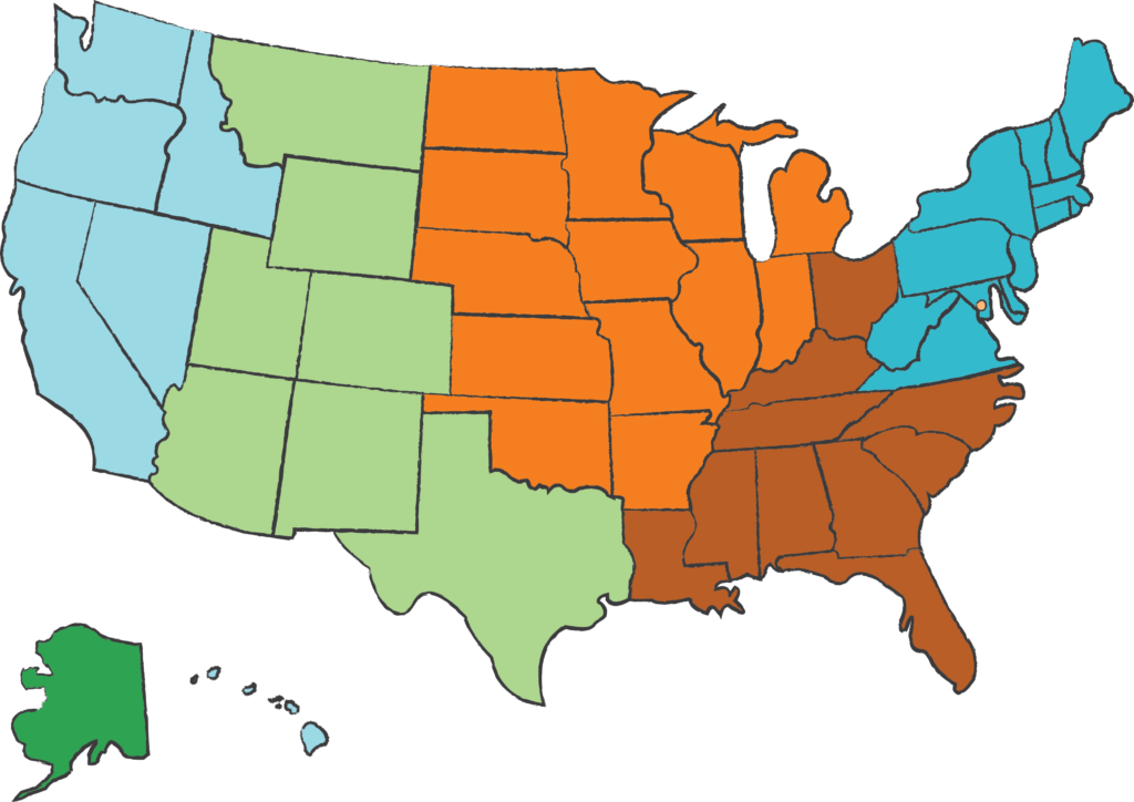
In order to explore these descriptive qualities, I created a Tableau visualization. The visualization allows the reader to explore and filter by a Grouped Unit Type (e.g., Some units such as National Battlefield, National Battlefield Park, and National Military Park are grouped under one unit) or by a Region. The regional breakout is by NPS Office regions. Using the color scheme of the visualization, the below map provides an illustration of the regional breakout.
To play with a full size version of the visualization, go here.
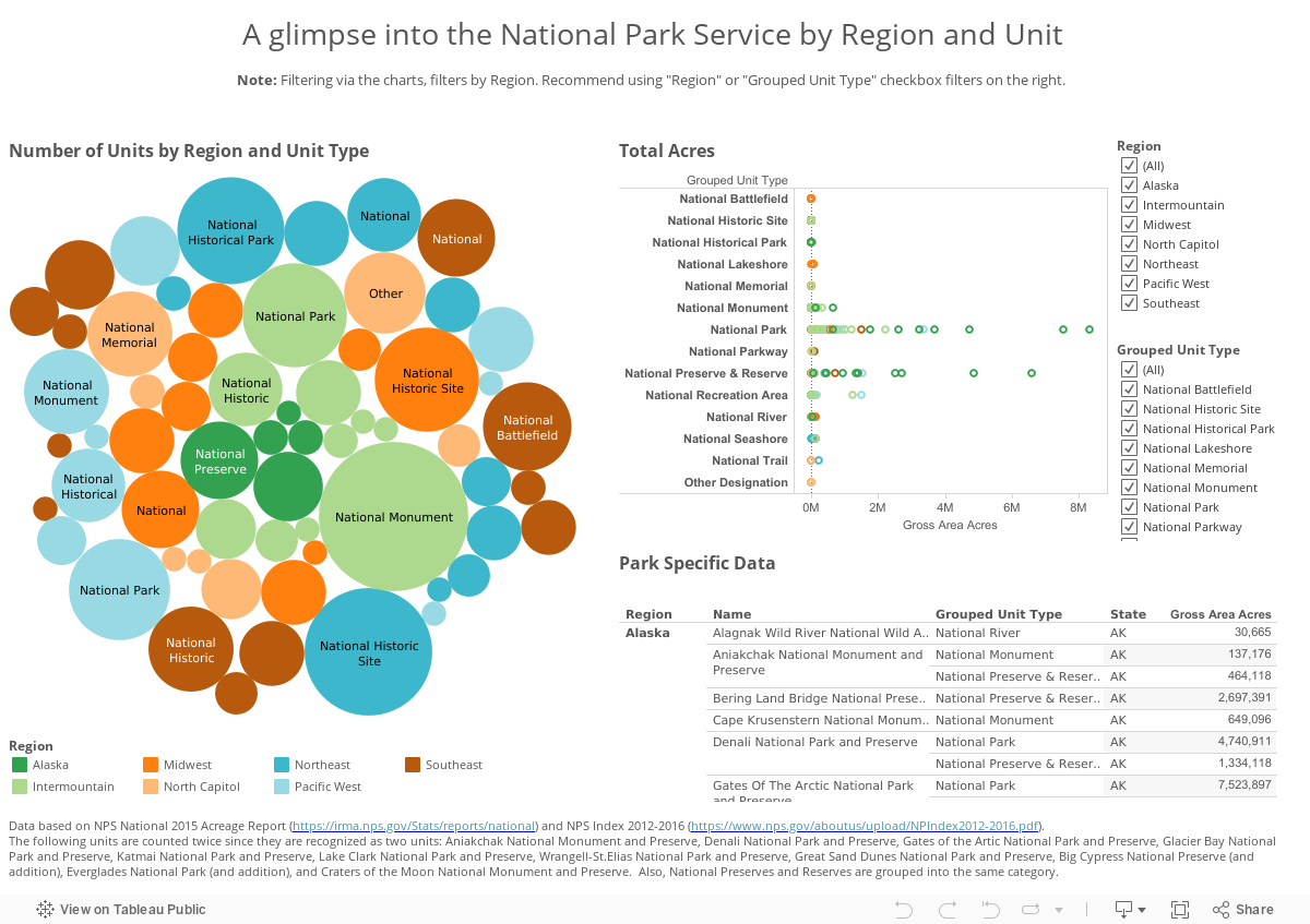
An interesting discovery from this visualization was that the Intermountain range had more than two times the number of National Monuments than National Parks, even though we think of the region predominately for its National Parks. Another interesting discovery was that the Northeast had the most National Historical Parks and National Historic Sites, but the Northeast does not contain the most National Monuments or National Memorials. I believe this occurs because a significant amount of our National history is in close proximity within this region, which aligns to a grouping within the NPS system. For instance, most of the sights in Boston are all categorized under one unit, a National Historical Park. What did you discover?